Info courtesy: Dr. John Jaeger
Interesting World Bank Site - "Take a trip around the world to discover how easy (or difficult) it is to do business in 181 economies."
Your business faculty members might find this site particularly interesting.
December 12, 2008
December 09, 2008
Financial Crisis: Say it Visually
Info courtesy: kenneth parker @ Understanding The Financial Crisis--For Kids and Grownups
On the same shelf:
November 26, 2008
Becoming Screen Literate (aka Digital Literacy, Browser Literacy)

By KEVIN KELLY
Published: November 21, 2008 @ NYTimes.com
Everywhere we look, we see screens. The other day I watched clips from a movie as I pumped gas into my car. The other night I saw a movie on the backseat of a plane. We will watch anywhere. Screens playing video pop up in the most unexpected places —
 like A.T.M. machines and supermarket checkout lines and tiny phones; some movie fans watch entire films in between calls. These ever-present screens have created an audience for very short moving pictures, as brief as three minutes, while cheap digital creation tools have empowered a new generation of filmmakers, who are rapidly filling up those screens. We are headed toward screen ubiquity. continue reading
NB. Info courtesy: doshdosh.com
See also on the same shelf:
October 21, 2008
INTERACTIVE MAP: U.S. Newspapers pick the president
Info courtesy: markstoneman @ Newspaper Endorsements & blog.techfun.org
http://10000words.net/presidential-endorsement-map.html
See also previous post: Visualizing Election Polls: An Animated, Interactive Way To Analyze Opinion Data
10000words.net: "The following map is a collective representation of the endorsements made by newspapers across the country for the 2008 presidential candidates. Currently Sen. Barack Obama leads Sen. John McCain in the number of endorsements made by the nation's newspapers as indicated by the blue markers. You can read the actual endorsement from each newspaper by clicking on the corresponding marker:"
http://10000words.net/presidential-endorsement-map.html
See also previous post: Visualizing Election Polls: An Animated, Interactive Way To Analyze Opinion Data
October 15, 2008
Visualizing Election Polls: An Animated, Interactive Way To Analyze Opinion Data
 ScienceDaily (Oct. 6, 2008) — "Do you want to know the percentage of white women who support vice presidential candidate Sarah Palin? What about college-educated versus high school-educated white women? Or those who also hunt?"
Continue reading / see alos: 5 Ways To Visualize The U.S. Elections
PS. This post is inspired by a visual: Palin's Debate Technique by deunadiana @ Cosmopolites' Kaffeeklatsch

October 12, 2008
Blog Popularity Visualized... + 75 Tools to Analyze your blog or website
Google PageRank: 5
Compete Rank: 17
Compete Rank: 17
Google BackLinks: 159
Yahoo BackLinks: 2,608
Technorati Links: 105
Yahoo BackLinks: 2,608
Technorati Links: 105
October 05, 2008
Concept Map / Mind Map Re-visited
>>NB. information courtesy: .:: Peta Konsep Anak Bangsa ::.
>>Older posts on the same shelf: Mind map / Concept Map
September 23, 2008
Visual dictionary -- open for all, free for all!

We're redefining the dictionary: Wordia. Search, define, share.
- Think of a word that has a special meaning to you.
- Record a video defining your word.
- Upload your video
See on the same shelf:
September 18, 2008
Semantic, Syntactic and Lexical Web Revisted


September 09, 2008
10 Amazing Visualizations of Social Networks
September 07, 2008
Lines and Bubbles and Bars, Oh My! New Ways to Sift Data
By ANNE EISENBERG
Published: August 30, 2008
PEOPLE share their videos on YouTube and their photos at Flickr. Now they can share more technical types of displays: graphs, charts and other visuals they create to help them analyze data buried in spreadsheets, tables or text.
At an experimental Web site, Many Eyes, (http://www.many-eyes.com/), users can upload the data they want to visualize, then try sophisticated tools to generate interactive displays. These might range from maps of relationships in the New Testament to a display of the comparative frequency of words used in speeches by Senators Hillary Rodham Clinton and Barack Obama. continue reading @ NYTimes.com
Visualizations : Co-Occurrences of Names in the New Testament (more complete data):
August 16, 2008
How to teach teens to drive safely -- Use the brain Map

Comments on this story  (10)
(10)
(10) In three decades as a brain surgeon, Dr. Charles Tator has operated on too many mangled teenagers hurt in preventable car crashes.
Social worker Gary Direnfeld has worked with too many brain-injured youth struggling to learn to speak or tie their shoes again after motor vehicle collisions.
August 07, 2008
Sensory Information Navigation - The Next Stage of Web Evolution = Web 3.0?
More from Gerry McKiernan @ Scholarship 2.0: An Idea Whose Time Has Come
- The Big Picture(sm): Visual Browsing in Web and non-Web Databases
- The Magic Touch(sm): Haptic Interaction in Web and non-Web Databases
- The Next WAVe(sm): Auditory Browsing in Web and non-Web Databases
- Text~Tone(sm): Auditory Highlighting/Rating of Text
- Morning Becomes Electric: Post-Modern Scholarly Information Access, Organization, and Navigation
- "New Age Navigation: Innovative Information Interfaces for Electronic Journals"
July 22, 2008
Mapping Top 1000 Canadian Corporate Landscape: 2007 & 2008
Info courtesy: Globeandmail reportonbusiness.com: Top 1000

July 19, 2008
Seven Simple Ways to Advance Your Career -- All in a Maze

1. Speak up.
2. Sit in the "hot seat."
3. Exercise your bragging rights.
4. Go beyond the call of duty.
5. Accept credit graciously.
6. Make more meaningful connections.
7. Give thanks. all by Phil Sheridan, UK Managing Director, Robert Half
July 10, 2008
Visual analogy : consciousness as the art of connecting
Excellent work.
Very good comment by a reviewer:
"This innovative history makes it possible to imagine the coming epoch of holistic multimedia in which analogy plays the role that allegory played in postmodernism."
--Gregory L. Ulmer, Professor of English and Media Studies, University of Florida
List of Illustrations vii
Preface xv
Preview: The Game of Back and Forth 11
Postmodernismand the Annihilation of Resemblance 72
Figures of Reconciliation 573
The Magic of Amorous Attraction 974
Recombinancy: Binding the Computational "New Mind" to the Combinatorial "Old Mind" 137
Postscript: Beyond Duality: From Adepts to Agents 180
Notes 185
Index 207
July 01, 2008
Web 2.0 Resume: Do These Push Pull Techniques Work-Well or Lead to Cloud Confusion?
At the outset it is all about visualization of the skills in an interactive / dynamic and creative modes--adding value, visibility, linkability, and most importantly, display relevance as a doer (not talker).
"Media rich resumes should highlight multiple ways to contact you from the traditional phone number, to email, instant messengers, and social networking pages (such as LinkedIn, Twitter, and Facebook)." New Media Resumes, Karen Burns
- Resume Cloud Image
- Visual (Screen Shot) Resume
- Skills Based Resume
- Web 2.0 resume app leverages SOA, Rails, cloud computing
- ThoughtMesh: An Innovative Scholarly Publishing and Discovery Model
- The Web 2.0 Résumé, By Marci Alboher
Web 2.0 Resume Guidelines
On the same shelf
June 26, 2008
Interesting Visual Dictionary

"This resource can also be used to help students understand ways research topics can be divided and/or organized."
Dr. John Jaeger
Doctoral Research and
Reference Librarian
Dallas Baptist University
June 15, 2008
Senseless Signage, Plus Other Visualizations
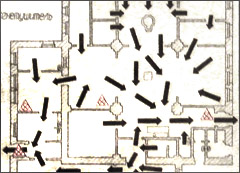
NB. Don't try to figure these signs out. Get a GPS instead:
Look for more fun, funny and fantastic images, visualizations, etc.
June 07, 2008
Semantic web search comes of age -- iCognue
by Kambam Deepak, The LMai algorithm; Sums up links.
SEO Ahmedabad : Learn & Share Everything about SEO
New Internet Search Engine
Hi Friends, I came across a very good article about new upcoming search engine iCognue. Here it goes.
 Sobha Renaissance Information Technology (SRIT) announced the launch of iCognue, its much awaited internet search engine powered by LMai (Latent Metonymical Analysis and Indexing), an algorithm for deriving the contextual relationship for a search topic.
Google in sight, search engines are getting smarter
May 26, 2008
Artificial General Intelligence: Now Is the Time
60 minute Google TechTalk: Dr. Ben Goertzel - Artificial General Intelligence: Now Is the Time. Source, and Essay
Info courtesy: Self-awarness of the Net
Info courtesy: Self-awarness of the Net
May 24, 2008
Visual Images Online: Digital Images of Primary Material on the Web
INTERNET RESOURCES
Visual resources online: Digital images of primary materials on public Web sites
C&RL News, May 2008
Vol. 69, No. 5
by Anne Blecksmith
When searching for images, the Internet is often the first and sometimes only research resource for scholars and educators, but many open-access digital image collections are part of the deep Web, keeping important visual content out of a search engine’s reach. In recent years, libraries, archives, and historical societies across the United States have created rich online visual resource collections that include a wealth of subjects and media formats. Researchers now have access to millions of primary materials from any Internet-accessible computer, which would otherwise require an in-person visit to the physical collection. Read more
Info courtesy: Dr. John Jaeger
May 10, 2008
The Informational Distance Between Cities

Information Aesthetics points to an interesting visualization of the "informational" relation between cities. Two cities are "informationally" related if they are often mentioned together, so the visualization uses the number of Google results to approximate the distance:
Gdistance(w1,w2) = (#(w1)+#(w2)) / (#(w1+" and "+w2)+#(w2+" and "+w1)),where #(w) is the number of Google search results for the query w enclosed in quotes.
continue reading (also see the comments from the site visitors)
Info courtesy: Haffu-Taffu.
May 03, 2008
Walk the Talk With Dr. Edward de Bono and get one-minute primer on the six hats
 Edward de Bono, Thought Guru makes people not only think about how they think, but also use new ways of looking at things to invent products, find solutions to persistent problems, and resolve conflict. In an interview with The Indian Express Editor-in-Chief Shekhar Gupta on NDTV 24x7's Walk the Talk, Dr de Bono talks about some of his thinking tools, how his training in medicine helped him arrive at some of his concepts, and about his meetings with Rajiv Gandhi, Dr A.P.J. Abdul Kalam, and Pervez Musharraf.
 Extract: If you give computers to young children, they start to believe that you don't have to think, all you have to do is search, and you'll find the answer. So, using computers is excellent, but you need, at the same time, to think. Now that extends beyond school. I've worked with major corporates throughout the world and they develop a habit of saying, 'Put all the information, all the information or data, into our computers, and our computers will analyse the data and that will set our strategy, make our decisions.' Very dangerous. Because unless you can look at the information in different ways, you are not going to make progress. And that's happening worldwide with the biggest corporates.
You know something interesting about Islam? The Prophet Muhammad had more to say about thinking than any other religious leader.
•In the Hadith, he says, 'One hour of thinking is better than 70 years of praying.' He says, 'The ink of a scholar is more holy than the blood of a martyr.' He says, 'One learned man gives more trouble to the Devil than a thousand worshippers.' That's Mohammad. In the Koran there are 130 verses about thinking. So, actually, when I go to the Middle East and tell them this, they don't know.Give me a one-minute primer on the six hats. How does it work?
... So the six hats separate out the thinking. Under the white hat, everyone is looking for facts, information, what we have, what we need, what questions have we asked, how do we get the information. Red hat: permission to put forward your emotions, your intuition, without having to justify or explain it. Black hat is critical: what is wrong, the risks, the downside, why it may not work. The yellow hat: values, benefits. The green hat: creative, new ideas, possibilities, alternatives and so on. The blue hat is the organizing hat: summary, outcome. The point is everyone is wearing the same hat at the same time. That's parallel thinking. That's important. Let me give an example. In a normal meeting, we may have someone who is against the idea being discussed. Normally, that person will spend the whole meeting attacking the idea. With the hats, under the black hat, he or she will be encouraged to be as critical as he or she can possibly be. Then, when it's the turn of the other hat, he's expected to look for value. And if he says, 'I can't see any value', and everyone else is seeing value, then he's seen to be stupid. So everyone is challenged to use their brain fully. continue reading
March 10, 2008
From Keyword Search to Exploration: How Result Visualization Aids Discovery on the Web
Kules, B., Wilson, M., Schraefel, M., Shneiderman, B. (February 2008), From Keyword Search to Exploration: How Result Visualization Aids Discovery on the Web: "Human computer interaction researchers and web browser designers have developed novel strategies to improve Web search by enabling users to conveniently visualize, manipulate, and organize their Web search results." [abstract][ fulltext, pdf]
My 2 cents: Here is an interesting visualization of optics, graphics, and perceptions in search and results of searches done using tools, such as, PIM (PHLAT), Cha-cha, The Flamenco--interface permits users to navigate by selecting from multiple facets (Materials and Structure Types)--etc. The table of figures is self explanatory:
March 06, 2008
2008 conferences: visualization of information
- Upcoming Vis Conferences in 2008 posted by Hilary Spencer @ Nature Network more on the above site by Nils Gehlenborg Tom Armitage
March 05, 2008
Cook up some visual fun @ ImageChef.com
[Info courtesy: Senior Friendly Libraries & NCS-Tech!And here is my visualization, based on ImageChef:
Searching the web, blogosphere, listservs and the twitterverse for the best K-8 EDTECH resources, because..."You can't spell TEACH without T-E-C-H!" © 2008 Kevin Jarrett]
![]()

March 03, 2008
East Vs West: Red Vs Blue -- Cultrual Differences Visualized
NB. East here refers, primarily, to Chinese (East Asia or in the past also called, Orient)' and West is interpreted as English speaking rest of the
West.
The images were designed by Yang Liu (sometimes spelled Liu Young), who was born in China and educated in Germany and England. Visit Yang Liu's website at yangliudesign.com. [info courtesy: Scott Imig & Sujatha.Thadakamalla, Auckland City Public Library]
Compare: Opinion, Way of Life, Punctuality, Contacts, Anger, Queue when Waiting, Sundays on the Road, Party, In the restaurant, Traveling, Handling of Problems, Three meals a day, Transportation, Elderly in day to day life, Moods and Weather, The Boss, What's Trendy, The child
Compare: Opinion, Way of Life, Punctuality, Contacts, Anger, Queue when Waiting, Sundays on the Road, Party, In the restaurant, Traveling, Handling of Problems, Three meals a day, Transportation, Elderly in day to day life, Moods and Weather, The Boss, What's Trendy, The child
Read this doc on Scribd:
East Vs West- A good observation represented pictorially to understand culture
March 02, 2008
A day in the creative life
Why commit to making one new thing each day and posting it online? Freedom of expression - and a kick in the pants to just do it
HAYLEY MICK
From Friday's Globe and Mail
February 29, 2008 at 7:53 AM ESTThing-a-day.com knit cook draw paint tape solder write install destroy invent document
1418 signed up, 609 started and have posted 6,573 things and wrote 6,682 comments so far.
February 25, 2008
CERN photos in National Geographic:The God Particle
[info courtesy: Xeni Jardin @ Boing Boing - A directory of wonderful things]

"If you were to dig a hole 300 feet straight down from the center of the charming French village of Crozet, you’d pop into a setting that calls to mind the subterranean lair of one of those James Bond villains" ... continue reading At the Heart of All Matter @ Thoughts of a Seeker
- See also in the same shelf: Go Inside the God Particle:
See how physicists will use a giant atom smasher in hopes of finding the so-called God particle.
February 22, 2008
Interactive Inflation map
ECONOMY: Inflation map @ CBC.ca - News - CLICK HERE: Interactive Feature : Roll over provinces and cities to view rate
See also: World Annual Rate of Inflation Map
February 15, 2008
Visualizing the holy books

"This visualization, by Philipp Steinweber and Andreas Koller, comes from the textual analysis of different religions’ holy books (red = Hinduism, yellow = Buddhism, green = Islam, blue = Judaism, purple = Christianity). Below each character is a list of verbs associated with him or her in each religion." continue reading: Visualization: Character Relationships across Religions From SimilarDiversity.net
- Biblical infographic diagrams: a collection of scripturally-correct infogr
 aphic diagrams outlining several major biblical concepts, including "The Seven Thousand Years Of Human History", "The Heavens", "The Resurrections and Judgments", or "The Failure Of Man". these information diagrams were made by Clarence Larkin about 75 year ago &, while appearing sparse at first, seem to pack a lot of information into a concise format.
 - Chris Harrison: Visualizing the Bible
- Visualizing the innernet @ Multifaith Information Gateway
- More charts, maps, and graphical visualization of the Bible, as attempted by Clarence Larkin:
February 10, 2008
Visual Search Assistant & Visual Browsers Revisited
[Info courtesy: nadeem.shabir, Talis @ YouTube adds Visual Browser]
OSkope Visual Search - A Fun Way To Search YouTube, Flickr, Ebay
Tags: OSkope Visual Search How Tutorial YouTube Video Images Flickr Amazon Ebay
OSkope Visual Search - A Fun Way To Search YouTube, Flickr, Ebay - Watch the top videos of the week here
"oSkope visual search" a playful way to browse for products, images and videos on Amazon, Ebay, YouTube and Flickr. You can save your searches and play videos directly on oSkope.
see also on the same shelf and aisle:
My Blog posts on Visual Browsing
http://swissmiss.typepad.com/weblog/2007/09/oskope.html posted @ swissmiss.
iDesktop.tv is a bright light in a sea of video conversion suck
Other Graphic tools that facilitate visualization: Browsing your FOAF social graph / Graph Gear and SpringGraph Flex Component: Includes: Thesaurus Roamer lets you explore connections between words and meanings, using thesaurus data from thesaurus.com; and Amazon Roamer uses a SpringGraph and Amazon Web Services to browse the “similar products” links of items from Amazon.com.
OSkope Visual Search - A Fun Way To Search YouTube, Flickr, Ebay
Tags: OSkope Visual Search How Tutorial YouTube Video Images Flickr Amazon Ebay
OSkope Visual Search - A Fun Way To Search YouTube, Flickr, Ebay - Watch the top videos of the week here
"oSkope visual search" a playful way to browse for products, images and videos on Amazon, Ebay, YouTube and Flickr. You can save your searches and play videos directly on oSkope.
see also on the same shelf and aisle:
February 03, 2008
Organization of Knowledge or On Arranging Books by Color

Rob Giampietro: On Arranging Books by Color
When it comes to the organization of knowledge, a lot is revealed by the system of organization that's used. For most serious academic libraries in America, the organizational system of choice was invented in 1874 by Melville Louis Kossuth Dewey (or Melvil Dui, as he liked to spell it), who was an assistant librarian at Amherst College when his eponymous system was devised.
... One of the words that would have caught Dewey's eye was "colour" — or, more patriotically spelled, "color" — and on this subject Dewey's opinions were perhaps a bit unorthodox. Later in his life, Dewey sponsored several pamphlets about Ro, a language created by Rev. Edward Powell Foster in which words are constructed using a categorical system similar to Dewey's own system for books. In Ro, words starting with "bofo-" are color words, as in "bofoc" for red (c=crimson?), and "bofof" for yellow (f=who knows?). Doesn't exactly roll off the tongue, does it? Replace the color words of this lovely final line from Robert Haas's poem "The Problem of Describing Color,"
Red, I said. Sudden, red.
with its Ro equivalents:
Bofoc, I said. Sudden, bofoc. .. continue reading Design Observer: writings about design & culture.
And, an interesting comment by a reader of the above article:
This brings to mind a story about the late Sufi writer Idries Shah. Someone visiting his house in England was found by an associate in the library, trying to make sense out of the strange assortment of books on the shelves. The associate smiled and explained: "You assumed these books could give you an indication of Shah's tastes in reading. In fact they're there to give him an indication about you. I expect your eye has run along these titles when you've been in this room with Shah. You can take it that all the titles you passed over, or paused at, were noted by him and helped in an assessment of YOU".
Posted by: james souttar
Info courtesy: by brigmlt
see also:
January 29, 2008
ScienceFoo Campers: JoVE (Journal of Visualized Experiments)
Click here for the video @ YouTube
Info courtesy: Gerry McKiernan @ Scholarship 2.0: An Idea Whose Time Has Come
January 19, 2008

January 06, 2008
Ways to help fight the fat: Visual Discrimination
Nov 10, 2007,Proposal: Legible labelling
Labels detailing the calorie and fat contents of our food are far too complex, especially for the poor, who are more likely to be new immigrants or have lower educational levels. A simple colour code using red for "should not be consumed," orange for "consume in limited quantities," and green for "don't worry about it" is one workable solution, says Dr. John Frank, head of population and public health studies at the Canadian Institutes of Health Research.
Pros: Such labels would leave little confusion about which foods were fattening.
Cons: Determining which foods deserved to be red f... continue readingsee also: color temperature color vision
Subscribe to:
Posts (Atom)