About this Blogsphere:

This blogsphere attempts to capture, catalog and share resources relating to visual perception of information. It is about a world mostly dealing with Physical (Touch, Taste, See/Sight, Smell and Hear) and sometimes Metaphysical (and that is none-of-the-above category). Physical, for instance, touch (e.g., feel, felt, found), look and visualization, is here with an attempt to combine verbal, vocal and visual--to synchronously see, hear, share and do much more. Interestingly, in order to visualize one does not need special skills, competencies, etc. It is all about common sense, especially with human visualizations. In short, "information is in the eye of the beholder." Continue reading much more all-ado-about this Blogosphere

Akbani is a Cutchi Memon family name.

December 23, 2012

One hundred diagrams that changed the world by Scott Christianson

100 Diagrams That Changed the World, by Brain Pickings

Extract:

A visual history of human sensemaking, from cave paintings to the world wide web.
Since the dawn of recorded history, we’ve been using visual depictions to map the Earth, order the heavens, make sense of time, dissect the human body, organize the natural world, perform music, and even concretize abstract concepts like consciousness and love.  

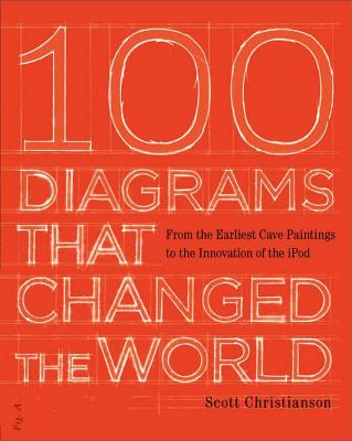
100 Diagrams That Changed the World (UK; public library) by investigative journalist and documentarian Scott Christianson chronicles the history of our evolving understanding of the world through humanity’s most groundbreaking sketches, illustrations, and drawings, ranging from cave paintings to The Rosetta Stone to Moses Harris’s color wheel to Tim Berners-Lee’s flowchart for a “mesh” information management system, the original blueprint for the world wide web. Continue reading

About this book (Amazon.com):
Recommended by The New York Times Book Review  ["This handsomely designed volume makes a case for the diagrams...provoking many 'aha moments.'"]
A collection of the most important ideas, theories, and concepts of all time
100 Diagrams That Changed the World is a fascinating collection of the most significant plans, sketches, drawings, and illustrations that have influenced and shaped the way we think about the world. From primitive cave paintings to Leonardo da Vinci’s Vitruvian Man to the complicated DNA helix drawn by Crick and Watson to the innovation of the iPod, they chart dramatic breakthroughs in our understanding of the world and its history. Arranged chronologically, each diagram is accompanied by informative text that makes even the most scientific breakthrough accessible to all.

MARC Record; World cat
Info courtesy: W.J. Pels (Jaap) @ km4dev.org.

September 19, 2012

The Library Catalogue as Social Space - Visual Catalog revisited

Sample of the emerging visual catalog (more details in the book: The Library Catalogue as Social Space)
Library Catalog Now on iPhone / Touch / iPad image courtesy: The Hong Kong University of Science and Technology.

The Library Catalogue as Social Space: Promoting Patron Driven Collections, Online Communities, and Enhanced Reference and Readers' Services, by Laurel Tarulli,Libraries Unlimited, 2012.

What do reviewers say:
>>"With the growing use of Web 2.0 by library patrons, integrating this technology into the catalog is the best way to reach patrons, and Tarulli helps both novice and seasoned librarians to achieve success in any library setting." - Booklist Online
>> "If you are thinking about what to do with your catalog to make it more interactive and relevant, this book is for you. Recommended." - Teacher Librarian
Extract:

This book is a guide to the library catalogue that all public library professionals will find enlightening and useful. Its technical services perspective provides a different point of view as compared to traditional public library literature, which is often written by frontline professionals. For example, it poses and examines this thought-provoking question: should library catalogues be considered the primary gateway to the library's information, rather than the library website? Author and collection access librarian Laurel Tarulli examines next-generation or "social" catalogues, discussing the theories and concepts behind them, their impact on core library services, and their potential in shaping future libraries and library services. Geared toward frontline and backroom staff, this book helps readers understand next-generation catalogues and see the collaborative opportunities that are possible between the frontline and backroom. Written to be much more than a "one-time" read, this resource book provides practical ideas for beneficial collaboration and implementation of social features in library catalogues.

September 08, 2012

Help teach robots to see - with your Kinect

Visual Dictionary and Visual Browsing revisited by Devin Coldewey

EXTRACT:
Swedish researchers are hoping to create a visual dictionary to improve the ability of robots to understand the world around them, but they can't do it alone. They need your help — if you've got a Kinect.

Robots are smart in that they can store tons of information and process it quickly, but unlike humans they haven't been walking the Earth for long, and have very little practical knowledge of common objects. How heavy is a coffee mug? No data, though a human could easily size it up and make a good estimate. What's that thing on the floor? A human would recognize it as a shoe, but to a robot, it could be anything.

A project called Kinect@Home is being led by Alper Aydemir at Sweden's Royal Institute of Technology. Aydemir hopes that by outsourcing that common knowledge to humans, robots will develop a better idea of their surroundings. To that end, he has started a database of 3-D models of everyday objects like books and shoes, captured with the cheap and effective Kinect. continue reading

May 30, 2012

A New Way to Search, Toronto Star

  • 'A whole new lens on the web'
    Search engine omits popular sites, leading to more random results [Search engine: Million Short] Toronto Star, Morgan Campbell, May 30, 2012

  • Definitely not the Oxford (Visual bookmark for the search ages uses Google to illustrate all 20,000 words found in dictionary), Stephanie Findlay; Toronto Star; May 30, 2012; pg. A.3;
  • April 22, 2012

    Visual Dictionaries Revisited

    Extract:
    "What is Visual Dictionary (Literacy Teaching Tools)? Visual dictionaries are a way for students to synthesize all of their newly gained knowledge into one organized and categorized whole. You can use this on a fairly low key level, like the sample included in this packet, or as an end-of-unit assessment. Regardless, students create their own categories for the major events, concepts, and people from your unit. Their visual, writing, reading, summarizing, and synthesizing skills are all used to come up with the finished product – something few tests, if any, will ever accomplish to quite this level."(Source: canyonsdistrict.org)**

    One reviewer's insight is far more sufficient to guide us in detecting what is visual and what is simply called as, visual. Reviewing Ultimate Visual Dictionary of Science, David Pressman, said:
    "Contrary to its title, the Ultimate Visual Dictionary of Science is not basically a visual dictionary of the type that can be used to find the names of things from their pictures. I think it is not a dictionary at all. Rather it is a condensed, highly illustrated encyclopedia of science."***


    What do the reviewers say about the following:
    From School Library Journal: Ultimate Visual Dictionary:
    YA-A beautiful dictionary that uses more than 6,000 full-color photographs, illustrations, and cross sections to explore most aspects of the natural world: the universe, prehistoric Earth, architecture, and much more. (Source: Amazon.com)

    From Library Journal: FIREFLY Five Language Visual Dictionary
    Richer and more detailed than DK's similar Five-Language Visual Dictionary, this brilliant work is essential for students of any of these languages, lovers of language, and any library supporting a language program or multilingual patrons.

    From Booklist: Ultimate Visual Dictionary / Merriam-Webster's Visual Dictionary:
    If a library has to choose, it's the difference between stilettos and sensible shoes. DK is sexier, but Merriam-Webster, with its clear illustrations and added definitions, is probably a better educational tool.


    ** What is visual dictionary?

    ***Ultimate Visual Dictionary of Science, David Pressman.

    April 18, 2012

    Find what speaks to you - - Visualizations

    One phrase, but multi-faceted, as seen in the following links

  • Pier 1 Imports: Find what speaks to you -- The world of advertising…. sometimes it produces great ads, sometimes it doesn't


  • ART: Find what speaks to you
  • What Speaks To You,`www.alwaysworthit.com
  • Poems - Peace Leaves: Day 22: Find What Speaks to You, http://lilyshineboutique.blogspot.ca
  • Are We There Yet? « Fox Interactive Consultant
    Pier One – Loved the creative ads and the tag line about ‘Find What Speaks To You’! It’s such a clever way to show how customers engage with companies they love.Take a look at Pier One’s latest ads that have been running this holiday season.
  • March 24, 2012

    Altmetrics in the Wild: Towards Creating a Live CV

    PS. It is again about Visual Resume and Bibliometrics (aka quantification, numbers, figures) with creataive imagination!!!

    Extract:

    by   
    The more scholars move their work online from where it was once ephemeral and hidden, the more they are integrating social media to their communication, the closer we are to telling what is the value that they themselves add to their content – and to blending these isolated factors to create a certain taste, a flavor.
    Jason Priem, whose talk on finding an n-dimensional impact space I recently examined on our blog, and Heather Piwowar (Research Remix), who studies the behavior of shared article clusters and post-publication datasets, together with Bradley M. Hemminger, have just presented a preprint to their manuscript on Altmetrics in the Wild: Using Social Media to Explore Scholarly Impact.
    “Articles cluster in ways that suggest different impact flavors,” they suggest in their work, sampling more than 20,000 articles, in search of a tool that would be complementary to traditional bibliometrics – that would measure process, instead of simply counting product, that would add a rich scale to the product, instead of simply keeping count.
    From the abstract: “In growing numbers, scholars are integrating social media tools like blogs, Twitter, and Mendeley into their professional communications. The online, public nature of these tools exposes and reifies scholarly processes once hidden and ephemeral. Metrics based on this activities could inform broader, faster measures of impact, complementing traditional citation metrics. Alternative metrics,” Piwowar et al. explain later on, “or “altmetrics” build on information from social media use, and could be employed side-by-side with citations — one tracking formal, acknowledged influence, and the other tracking the unintentional and informal “scientific street cred”. The future, then, could see altmetrics and traditional bibliometrics presented together as complementary tools presenting a nuanced, multidimensional view of multiple research impacts at multiple time scales.”
    Continue reading ...

    On the same shelf:
  • Time to spring clean your digital footprint
  • How social networks sold your privacy
  • Executive 'forced out of job' over LinkedIn CV - Telegraph
  • Managing your online footprint
  • 5 Tips to Leverage Social Media to Get a Job
  • Seven Steps to Secure Successful Employment Using Social Media
  • Resume, Cover Letter And Your Facebook Password?
    ‎‎
          
  • February 13, 2012

    Advertising the way we don’t see it -- World from the Otherside!!!

    Excellent visualization, from the world of Advertisements and the world of Mass Media...

    Extract:
    The World as We Don’t See it
    The other side of the normal things that arent normal


    continue reading more from The World as We Don’t See it

    More on the same shelf:

    January 12, 2012

    Reading now: The Wall Street Journal Guide to Information Graphics: The Dos and Don'ts of Presenting Data, Facts, and Figures

    Norton, W. W. & Company, Inc., 2010. ISBN-13: 9780393072952 @ Amazon.com


    About the author:
    Dona M. Wong has a MFA degree from Yale University, where she completed her dissertation on information design with thesis advisor Edward Tufte, a recognized authority on data visualization. Today she is the strategy director for information design at the global consulting firm Siegel+Gale, a pioneer in simplifying customer communications. She lives in New York City.

    Recommendations by readers @ Amazon:
    This book provides a handy desk reference for anyone who has to present data in graphical form - one might think of it a visual AP Style Book for graphics... [C. Muser]
    Written with a style and clarity that reflects her approach to infographics, it provides an outstanding guide to creating visuals that are clear and to the point. The book is itself an example of communicating without excess whilst delivering a message effectively. (If you have every read Edwarde Tufte's seminal books you will appreciate Dona's clarity)... [Lee Featherby]

    PS. Reviews are in magazines and in journals:

  • Bowen, L. (2010). The Wall Street Journal Guide to Information Graphics. Communication Arts, 51(6), 218.
  • "Siegel+Gale; Business Charts often Fail to Communicate Intended Message, Says Siegel+Gales Dona Wong, Author of Newly Published the Wall Street Journal Guide to Information Graphics." Marketing Weekly News.(Feb 13, 2010): 112.

    On the same shelf: