About this Blogsphere:

This blogsphere attempts to capture, catalog and share resources relating to visual perception of information. It is about a world mostly dealing with Physical (Touch, Taste, See/Sight, Smell and Hear) and sometimes Metaphysical (and that is none-of-the-above category). Physical, for instance, touch (e.g., feel, felt, found), look and visualization, is here with an attempt to combine verbal, vocal and visual--to synchronously see, hear, share and do much more. Interestingly, in order to visualize one does not need special skills, competencies, etc. It is all about common sense, especially with human visualizations. In short, "information is in the eye of the beholder." Continue reading much more all-ado-about this Blogosphere

Akbani is a Cutchi Memon family name.

December 14, 2010

Visualizing Facebook Friendships Across the Globe According to Paul Butler

Facebook intern Paul Butler created a visualization of Facebook connections around the globe,

By Ben Parr, Mashable, CNN
STORY HIGHLIGHTS
* A Facebook intern created a visualization of Facebook connections around the globe
* Using a sample of 10 million friend pairs, he correlated them with their current cities
* The U.S. has the highest concentration of Facebook friendships while Africa has the lowest
Continue reading Facebook relationships visualized

Here is what Butler had to say @ newsday.com:
"After a few minutes of rendering, the new plot appeared, and I was a bit taken aback by what I saw. The blob had turned into a surprisingly detailed map of the world. Not only were continents visible, certain international borders were apparent as well. What really struck me, though, was knowing that the lines didn't represent coasts or rivers or political borders, but real human relationships. Each line might represent a friendship made while travelling, a family member abroad, or an old college friend pulled away by the various forces of life."

Facebook staffer Paul Butler has created this beautiful map of the millions (billions?) of friendships stored in the social network, using something that looks like edge bundles to create the beautiful map. Says, Randall Hand @ | VizWorld.com

On the same shelf:
  • Tim Berners-Lee says Facebook 'threatens' web future
  • Facebook Q&A Update: Sorry, we're not ready for you just yet
  • Google Alerts' mybookface! And, the true colors of Internet Explorer and Firefox Web Browsers in dealing with Web forgery
  • Facebook penetration: a whopping 40% in Canada - with UK a close second
  • April 25, 2010

    I want to download your mind…

    Posted on February 19, 2010 by Eva Schiffer @ Net-Map Toolbox:

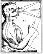
    Descartes "Mind and Body" source Wikipedia Commons

    When doing qualitative research there are so many nuances in the answers, that it often feels like: If you weren’t there, you won’t be able to really get it. Unless you can download the interviewer’s mind. Which – so far – is not possible. When I started developing and using Net-Map this didn’t matter much, because projects where small and basically I would be the person doing both, the interviewing and the analysis. Or I’d teach another research who would do another small project, doing both, the interviewing and the interpretation. But with this model you can only grow so far and I know we should be able to do better than this, to work in a bigger team of researchers, facilitators, interpreters and benefit from each others’ experience and insight, without plugging a USB cord into each others’ ears. continue reading

    March 25, 2010

    text-free user interfaces - Medhi interface


    Indrani Medhi brings the power of computing to illiterate, first-time users in India.

    “It really came as a very pleasant surprise,” says Medhi, an associate researcher in the Technology for Emerging Markets group at Microsoft Research India whose work in text-free user interfaces is being featured by MoMA. “From the beginning, we did not think of this as an art project. We just thought of it as solving a particular problem.

    March 14, 2010

    SuperPower: Visualising the Internet's The top 100 sites

    NB. Info courtesy: Dr. John Jaeger, Dallas Baptist University
    Image courtesy: Paul Adams, VizWorld.com

    BBC News - The top 100 sites on the internet
    Explore this interactive graphic to find out which are the biggest sites on the internet, as measured by the Nielsen company. This feature is part of SuperPower, a season of programmes exploring the power of the internet.

    The data used to generate the interactive treemap visualisation was collected by the Nielsen company and covers the UK, France, Germany, Italy, Spain, Switzerland, Brazil, US and Australia. The figures represent unique users for the month of January 2010.

    The categories – such as retail, social networks, search/portal – were defined by the BBC. Because some websites have more than one use, they could fall within more than one category (e.g. Yahoo). However, the treemap only classifies them once.

    The maps were produced using the Prefuse Flare software, developed by the University of California Berkeley.

    February 27, 2010

    Google is making people stupid, Revisited

    Original article: Is Google Making Us Stupid? - The Atlantic (July/August 2008)
    Noe: The Internet can make you smarter, experts say, CNET News, February 22, 2010
    Responses to a tension pair about whether 'Google is making people stupid'

    "Responses to this 2020 scenario were assembled from Internet stakeholders in the 2010 Pew Internet & American Life/Elon University Future of the Internet Survey. Some respondents chose to identify themselves; many did not. We share some—not all—of the responses here. Workplaces of respondents who shared their identity are attributed only for the purpose of indicating a level of expertise; statements reflect personal views. If you would like to participate in the next survey, mail andersj [at] elon dotedu; include information on your expertise. "


    On the same shelf:

    February 15, 2010

    The State of Information Visualization

    Info courtesy: Patrick Lambe @ Green Chameleon


    EXTRACT:“The State of Information Visualization” by Robert Kosara
    Information Visualization (InfoVis) is an exciting field to watch grow and expand into ever new areas. Last year brought some interesting developments that point towards changes in how we do and see visualization. What does 2010 hold in store? Here is a look back and some ideas where we're heading.

  • 2009: What Was
  • 2010: What Will Be
  • Beyond 2010: What Is to Come... continue reading The State of Information Visualization
  • Deconstructing the Learning Pyramid

    To start with, till yesterday, I did not know about the existence of a Learning Pyramid.

    Thanks to IT Coaching and their visualization "What I hear, I forget; What I see, I remember; But what I do, I understand". Their site has a graphic image of Learning Pyramid.
    Thanks to Google it brought me to the following: Deconstructing the Learning Pyramid
    "Presentation given to Berkeley Library staff at the Instructor Development Program's Active Learning Lightning Talks in April 2009. Debunks the "learning pyramid" and suggests that instructional strategies should be made more "active" by considering the experience level of the audience and the strengths of the instructor:

    On the same shelf:


    January 14, 2010

    Subliminal Advertising - What you see is what you get, but not necessarily what you want to know

    WYSIWYG --(What-You-See-Is-What-You-Get)-- (pronounced /ˈwɪziˌwɪg/), and it's true colors are here.

    "A clip from the movie, Josie and the Pussycats, explaining subliminal advertising through music"


    Subliminal Messages Busted:


    Creepy Subliminal Messages:


    See on the same shelf: