About this Blogsphere:

This blogsphere attempts to capture, catalog and share resources relating to visual perception of information. It is about a world mostly dealing with Physical (Touch, Taste, See/Sight, Smell and Hear) and sometimes Metaphysical (and that is none-of-the-above category). Physical, for instance, touch (e.g., feel, felt, found), look and visualization, is here with an attempt to combine verbal, vocal and visual--to synchronously see, hear, share and do much more. Interestingly, in order to visualize one does not need special skills, competencies, etc. It is all about common sense, especially with human visualizations. In short, "information is in the eye of the beholder." Continue reading much more all-ado-about this Blogosphere

Akbani is a Cutchi Memon family name.

Showing posts with label Websites as Graphs. Show all posts

March 14, 2010

SuperPower: Visualising the Internet's The top 100 sites

NB. Info courtesy: Dr. John Jaeger, Dallas Baptist University
Image courtesy: Paul Adams, VizWorld.com

BBC News - The top 100 sites on the internet
Explore this interactive graphic to find out which are the biggest sites on the internet, as measured by the Nielsen company. This feature is part of SuperPower, a season of programmes exploring the power of the internet.

The data used to generate the interactive treemap visualisation was collected by the Nielsen company and covers the UK, France, Germany, Italy, Spain, Switzerland, Brazil, US and Australia. The figures represent unique users for the month of January 2010.

The categories – such as retail, social networks, search/portal – were defined by the BBC. Because some websites have more than one use, they could fall within more than one category (e.g. Yahoo). However, the treemap only classifies them once.

The maps were produced using the Prefuse Flare software, developed by the University of California Berkeley.

December 12, 2008

Business Planet: Mapping the Business Environment

Info courtesy: Dr. John Jaeger
Interesting World Bank Site - "Take a trip around the world to discover how easy (or difficult) it is to do business in 181 economies."
Your business faculty members might find this site particularly interesting.


September 07, 2008

Lines and Bubbles and Bars, Oh My! New Ways to Sift Data

By ANNE EISENBERG
Published: August 30, 2008
PEOPLE share their videos on YouTube and their photos at Flickr. Now they can share more technical types of displays: graphs, charts and other visuals they create to help them analyze data buried in spreadsheets, tables or text.

At an experimental Web site, Many Eyes, (http://www.many-eyes.com/), users can upload the data they want to visualize, then try sophisticated tools to generate interactive displays. These might range from maps of relationships in the New Testament to a display of the comparative frequency of words used in speeches by Senators Hillary Rodham Clinton and Barack Obama. continue reading @ NYTimes.com


Visualizations : Co-Occurrences of Names in the New Testament (more complete data):


August 07, 2008

Sensory Information Navigation - The Next Stage of Web Evolution = Web 3.0?

  • The Big Picture(sm): Visual Browsing in Web and non-Web Databases
  • The Magic Touch(sm): Haptic Interaction in Web and non-Web Databases
  • The Next WAVe(sm): Auditory Browsing in Web and non-Web Databases
  • Text~Tone(sm): Auditory Highlighting/Rating of Text
  • Morning Becomes Electric: Post-Modern Scholarly Information Access, Organization, and Navigation
  • "New Age Navigation: Innovative Information Interfaces for Electronic Journals"
More from Gerry McKiernan @ Scholarship 2.0: An Idea Whose Time Has Come

November 03, 2007

Mapping the Unmappable: Visualization continues to advance

Quotable quote of the year: 16 years ago today the word "Internet" first appeared on af ront page or cover of the major media: Wall Street Journal, Page One, the story about eBooks -- 29 Oct, 2007. Thus said: Michael S. Hart, Founder Project Gutenberg

See in same shelf and aisle:


  • A looming legal crises on the Internet, MICHAEL RIGLER, The Western Star
  • October 14, 2007

    Visualising Complexity & KM Communications Strategy: Mind maps

    PS. The following info. is from Green Chameleon and Straits Knowledge Website.

    For those interested in visualisation of complex information, or the visual power of mapping networks, here’s a wonderful resource unearthed by my iKMS colleague Kong Heng Sun.


    This concept map catalogues all the elements of a KM communications strategy that we’ve found useful, with some ideas for messages, media and audiences. Download the pdf version formatted for A3 size printing for easier reading!

    October 01, 2007

    IEEE InfoVis 2007

    October 28 - October 30, 2007

    Join us Sunday, October 28, through Tuesday, October 30, 2007, in conjunction with the IEEE Visualization 2007 Conference and IEEE VAST 2007 Symposium in Sacramento, California.

    The conference program is now set. Please click here for a schedule of conference events.

    Keynote and Capstone speakers set. Two dynamic invited speakers, Matthew Ericson of the New York Times (IEEE InfoVis keynote) and Stephen Few of Perceptual Edge (combined IEEE InfoVis capstone/IEEE VAST capstone) will be presenting talks.

    click here for more info

    September 09, 2007

    Visualizing the ‘Power Struggle’ in Wikipedia

    "A new visualization Bruce Herr and I recently completed is being featured in this week’s New Scientist Magazine (the article is free online, minus the viz). They did a good job jazzing up the language used to describe the viz–’power struggle’, ‘bubbling mass’, ‘blitzed articles’–but they also dumbed down the technical accomplishments. I guess not everyone gets as excited about algorithms as I do. "


    August 25, 2007

    Visual immersion using Web Analytics

    Practical analytics: persuasion scenarios
    @ immeria - An immersion in Web Analytics,
    by S.Hamel
    A typical site is composed of several conversion objectives: registering to a newsletter, purchasing something, finding the nearest store, or any activity that represent a positive outcome for the user and the site owner. As Brian Eisenberg puts it, those represents the "conversion points" of a "persuasion scenario":


    continue reading:

    Practical analytics: persuasion scenarios


    See also my previous posts:
  • Eye to I: Visual Literacy
  • Add Sense to your AdSense: Visualizing the Return on Investment?
  • Look and Feel of Browsers and Websites
  • Concept Mapping Technology - Tool to create HTML pathfinders?
  • Visualizing the Innernet or Visual Display of the Website's Infostructure - AHAREF
  • July 10, 2007

    Browse articles visually with WikiMindMap

    via Lifehacker by Adam Pash on Jul 09, 2007

    Web site WikiMindMap turns complex Wikipedia articles into a visual representations of ideas (i.e., a mind map) to give you an overview of the important concepts and topics related to an idea.

    Browsing a Wikipedia article with WikiMindMap may seem a bit confusing at first, especially if you don't regularly use mind maps, but it offers an interesting way to get a broad understanding of a topic and explore some of the related topics.


    see also:
  • Mind map - Wikipedia, the free encyclopedia
  • Using Mind Maps to Reach Visual Thinkers
  • Mindmapping as a tool for assignments
  • June 13, 2006

    Visualizing the Innernet or Visual Display of the Website's Infostructure

    Show, don't tell, is the bottom line here.
    Websites have their own faces, features, facets, and factbites. Many are however not visualized. Interestingly, businesses and communication portals are now looking (not just at the surface and beyond), even at the inner self. This soul searching is good and hope it lasts longer. By the way, I am not alone in inviting attention to the Innernet (no spelling error) in a material world***
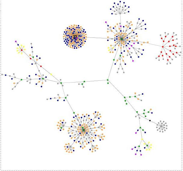
    What follows is a visual of my two blogs' (or Website's) infostructure (not infrastructure, for a difference click here). Click at any of the images, given below and you can visualize the true colors of the content.


    Image on the right: Multifaith Hall of Fame of the 21st century
    Image on the left: Blog As A Teaching Tool
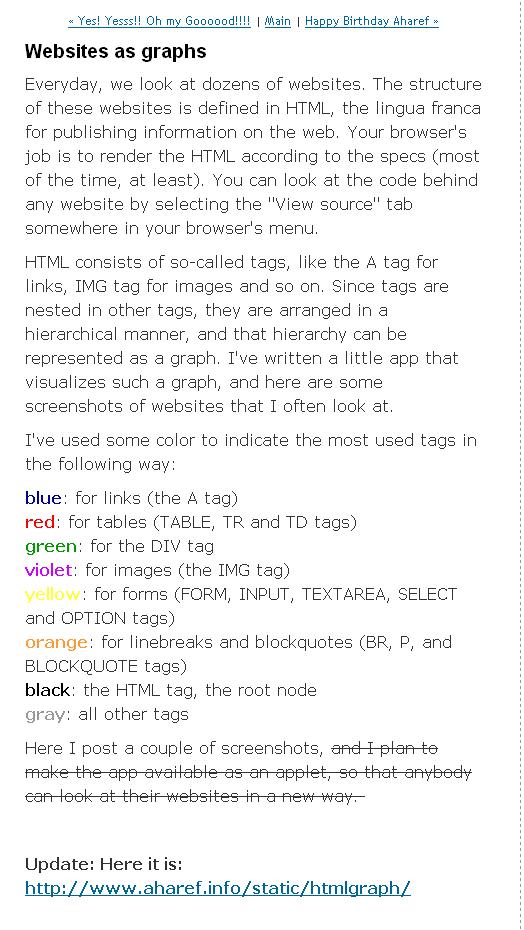
    The meaning of the colors in the above images is well stated by the author of aharef. See the following:
    Acknowledgement: Thanks to Teblog of David Tebbutt for the information visualization tool, viz., Aharef's website-mapper.
    I am amzaed by the way Ted has visualized this graphics: Website Structure (beautifully) Revealed [details]. His tell tale is:
    As a way of highlighting areas for improvement, this is brilliant. It is also quite hypnotic to watch the image evolve.

    Ted has identified another source: Aharef’s Wikipedia site-map. Click and Visualize

    Incidentally, he was inspired by a master visualizer, Guillaume du Gardier. I envy Guillaume du Gardier for his PR and Communication skills. His blog is loaded (I mean it in a positive sense) with all types of graphics, images, and visuals [view here].

    A word about other graphics and applications that pre-date Aharef's website-mapper.
    Knowledge managers have been adopting this sense-making approach in their own ways. See Lennart Björneborn's doctoal work,
    The Corona model with examples of link paths and reachability structures between different graph components in a web space (modified after the Bow-Tie model by Broder et al. 2000) [Details]
    ~~~~Links are for use – the very essence of hypertext;
    ~~~~Every surfer his or her link – the rich diversity of links across topics and genres;
    ~~~~Every link its surfer – ditto;
    ~~~~Save the time of the surfer – visualizing web clusters and small-world shortcuts;
    ~~~~The Web is a growing organism
    quoted in PhD dissertation in webometrics:
    Small-World Link Structures across an Academic Web Space - a Library and Information Science Approach.

    P.S. "I didn't say a word. They did." Thus Spake Feroze Thank you Mr. Feroze for giving me this message in seven short words (amidst your thousand worded blog). You are a creative visualizer (see his blog: my1000words). Thank you also for letting me learn that visuals speak on their own (we don't need to always use a 1000 words).
    ----
    Similar Resources:
    *** There are many more in this stream to give you such an insight:
  • Cover story of the May / June 2006 AIIM E-Doc Magazine, has a lead article on Be Serene: Channel you inner records manager, detials
  • Centre for Spirituality at Work "Fostering good karma a touchy subject; Spirituality is the 'last frontier' of workplace enightenment, but Wallace Immen finds interest in exploding, May 24, 2006 [You may find these articles of interest: An article from the www.Spirituality.com website about our Founding Director, Sherry Connolly, MBA, MDiv, DMin (cand.)]
  • Putting Reflection into Gear, BY : John Baldoni, [ON LEADERSHIP COMMUNICATION] 06/28/2006
  • Vertical and tacit: Multifaith and Knowledge Management in Perspective, details
  • Labyrinths, Sacred Geometry, Innernet & Visualization, details
  • See also: Richmond, Lewis. Work as a spiritual practice : a practical Buddhist approach to inner growth and satisfaction on the job (Broadway Books, c1999)