It’s every book lover’s dream to have an in-house library, and we’ve rounded up a few dozen beautiful bookshelf ideas to inspire your own! ... Much more http://media.bookbub.com/blog/2015/01/21/21-awesome-bookshelf-ideas
February 16, 2015
21 Stunning Bookshelves You’ll Want for Your Home
August 17, 2014
Mapping the intellectual structure in the area of humanities: Visualizing citation networks
Jill Walker Rettberg’s Visualizing Networks of Electronic Literature maps the fragmentary and dynamic field of electronic literature by analyzing citations in 44 doctoral dissertations published between 2002 and 2013. Applying “distant reading” strategies to the ELMCIP Knowledge Base, Rettberg identifies key works in the field, shifting genres, and changing approaches to scholarship.

June 08, 2014
A Creative Visual Formula to Know Readability in 'My Library' @ CARTOONS BY TOM GAULD

You're All Just Jealous of My Jetpack: Cartoons
By Tom Gauld -- Tom Gauld lives in London. His comics frequently appear in The Guardian, The New York Times, and The Believer. He has designed a number of book covers.
Which color dominates in your library? (cartoon)
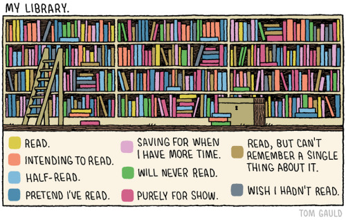
what’s the difference between “intending to read” and “saving for when I have more time”? or between “pretend I’ve read” and “purely for show” Source: book of cartoons ‘You’re All Just Jealous of my Jetpack
Review: ""Tom Gauld is pretty brilliant. You’re All Just Jealous of My Jetpack..
is ... dark and funny. Some of the best comics in the collection are
the bookish ones, taking chummy digs at everyone from Martin Amis to the
Brontës to “proper literature.” —Flavorwire
-- (see also notes)
- What kind of library user are you (Quiz)? Are you a “Library Lover”? An “Information Omnivore”? Or are you totally “Off the Grid”? Take our library engagement quiz to learn how your library habits and attitudes stack up against the general population.
- BOOKS BEAT SUMMER SLIDE! Check out our latest infographic to see just how much kids' reading skills improve when they have access to books over the summer.

May 22, 2014
The Life Cycle of Ideas -- Visualizing Citations

Note: * * * Here is an article using the techniques of citation analysis. By implication, is very similar to a visualization of Dr. SR Ranganathan's idea plane!!!.Here is one sample of citation analysis, visualized as Dr. SR Ranganathan's idea plane!!! (more this here). Co-incidentally, Ranganathan's colleague, Dr G. Bhattacharya (@ DRTC), developed the idea of popsi (Postulate-based Permuted Subject Indexing), and the following image and article appear in a journal Popular Science, whose acronym is popsci.***
'How scientific concepts rise and fall,' By Katie Peek
-- image courtesy: popsci.com
On the same shelf:
- Life sciences tend to have a flatter citations trend [shaded portion], perhaps because ideas in the field are easier for other experts to grasp—in contrast to fields like mathematics—so it takes less time for them to catch on.
- Among the authors who wrote multiple top papers [arcs that link dots] are five Nobel laureates. John Pople, a theoretical chemist who won in 1998, appears twice in multidisciplinary chemistry and three times in physical chemistry.
- Large numbers of authors [dots] tend to appear on more recent papers, as in environmental science. Ambitious experiments today can require hundreds of scientists, and in some fields big collaborations can lead to very long author lists.
- The most-cited papers [black music notes]have longer lifetimes than others [shaded portions]. Some are methods papers, which lay out experimental techniques other scientists use. Others articulate important theories, cited for decades.
- Everything is Editorial: Why Algorithms are Hand-Made, Human, and Not Just for Search Anymore by Aaron Kirschenfeld
May 19, 2014
Comparing Indian states and territories with countries --The Economist Visual Map
PS. Click on the image to go to the dynamic visual map @ The EconomistComparing Indian states and territories with countries An Indian summary Which countries match the GDP and population of India's states and territories? How big is Uttar Pradesh, India's most populous state? One way of answering the question is to take its total area: 95,000 square miles (246,000 sq km). Another way is to think of it as a country. If Uttar Pradesh were to declare independence, it would be the world's fifth most populous country (as the map below shows, it has about the same number of residents as Brazil). Yet its economy would only be the size of Qatar, a tiny oil-rich state of fewer than 2m people. That makes it poor on a per person basis. Despite India's two decades of rapid growth, Uttar Pradesh's GDP per head is close to that of Kenya. The map below presents country equivalents for India's states and territories in terms of GDP, GDP per person (in PPP terms) and population. Please play around with it and tell us what you think.
May 17, 2014
India Elections 2014 : Search Engine Infographics
What's new for 2014:
Google:

bing:

Yahoo

On the same shelf:
- Google to introduce new features for "live" election results ...
- Infographic · India Elections 2014 Weekly Trends (week 08). added by ... Indian Elections 2014 | Visual.ly
- Google Doodle salutes Lok Sabha polls, hindustantimes.com

Google:
bing:
Yahoo
On the same shelf:
- US scientists 'hack' India electronic voting machines, BBC
- How Secure Are India's Elections? Huffington Post
- ELECTION COMMISSION OF INDIA: GENERAL ELECTION TO LOK SABHA TRENDS & RESULT 2014 -- Click links below for
Partywise Constituencywise-All Candidates Constituencywise Trends
Subscribe to:
Comments (Atom)